
Chartdirector® Charts
Contour Plots
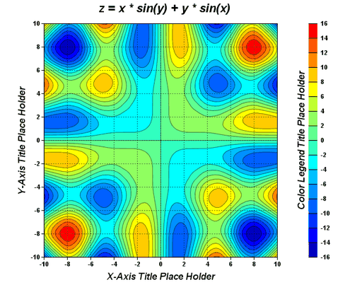
In a contour chart, the input data are the values of some points on the xy plane. ChartDirector uses advanced surface fitting techniques to compute the surface, and visualizes the results as colors and contours on the xy plane.
Note the detail, smooth and fully anti-aliased contours in this chart. SimplexNumerica supports spline surface fitting. This produces smooth contours, even if the input contains only a few data points.
This contour chart/heat map uses continuous coloring instead of changing the colors in discrete steps.

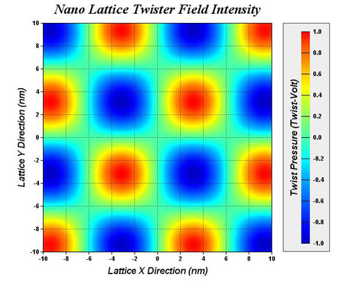
This contour chart uses scattered data points (instead of gridded data points).
The "X" symbol in this chart is added by a scatter layer, so you can see the positions of the data points.
Note the smooth contours, even in regions where the data points are sparse. This shows the usefulness of ChartDirector's spline surface fitting method.