
Chartdirector® Charts
Polar Charts
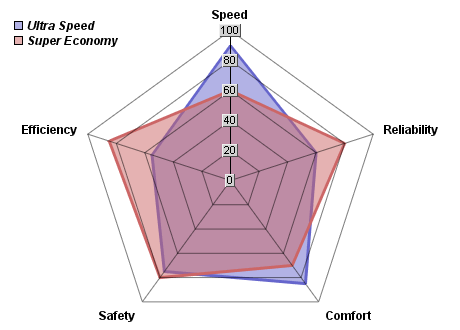
A radar chart with two layers.
Semi-transparent colors are used to ensure both layers can be clearly seen.
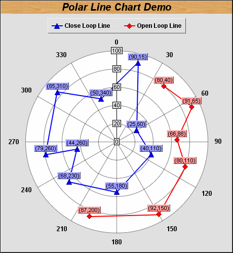
A polar chart with two polar line layers. One of the line is configured as close loop, with the other as open loop.
Data points are marked by symbols, with data labels on top of the symbols.

A polar stacked area chart.

A polar chart with a polar spline area layer, and a polar spline line layer.
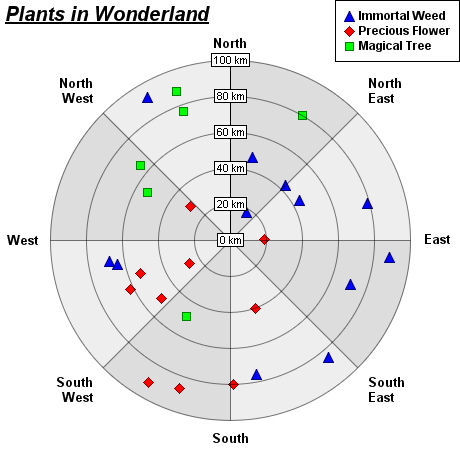
A polar scatter chart, with alternating background colors in the angular direction.
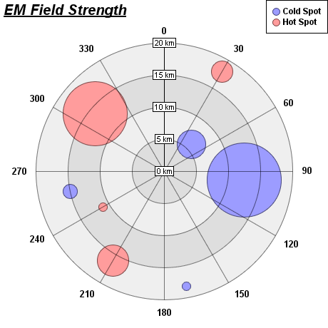
A polar bubble chart, with alternating background colors in the radial direction.
In ChartDirector, a bubble chart is a scatter chart with variable symbol sizes. Any scatter symbols or custom images can be used.
In this example, circles are used as symbols.
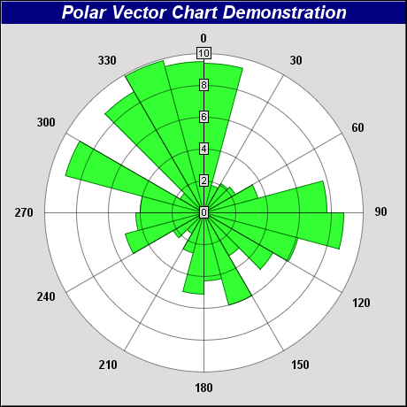
This chart style is sometimes known as a "rose" chart, or "circumplex" chart.
This chart is created by using sector zones of variable directions and radii.

A stacked rose chart.
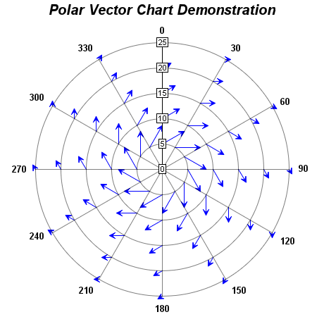
A polar vector chart, comprises of arrows with arbitrary lengths and directions.

A polar spline line chart with circle symbols for the data points.
Concentric circular background zones are used to indicate radial data ranges.

A polar line chart with cross symbols for the data points.
Sector background zones are used to indicate angular data ranges.