
Chartdirector® Charts
2D Bar Charts
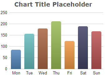
A multi-color bar chart in which the bars are gradient colored and with rounded corners.
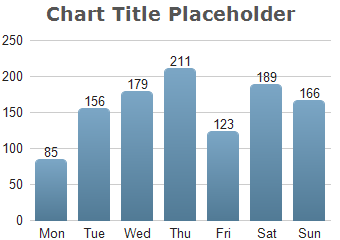
A bar chart in which the bars are gradient colored, with rounded corners and with bar labels.
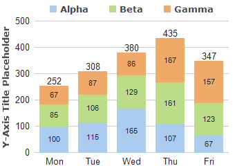
A stacked bar chart with data labels for bar segments as well as whole bars.
A bar layer with the bars touching each other, and with a spline layer on top.
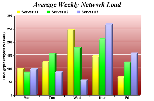
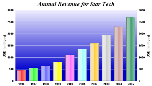
A 3D multi-bar chart using gradient colors for the bars as well as the background.
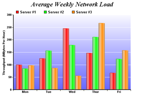
A 3D bar chart with depth layout. Semi-transparent colors are used so you can see through the bar layers.
A 3D multi-bar chart with a gradient background color and soft lighting effects.
A multi-bar chart with a gradient background color and glass shading effects.
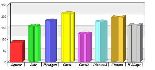
SimplexNumerica supports bars of cylindrical and arbitrary polygonal shapes on the same chart. This chart demonstrates bars with various polygon shapes.

A multi-color horizontal bar chart, using gradient colors for the bars as well as the background.
SimplexNumerica allows the four corners of the chart to be independently rounded with different radii. In this chart, two of the corners are rounded for decoration purpose.

A multi-stacked bar chart, which contains stacked bars clustered together.
Note the axis labels. They are with icons! These are created using SimplexNumerica Mark Up Language (CDML).
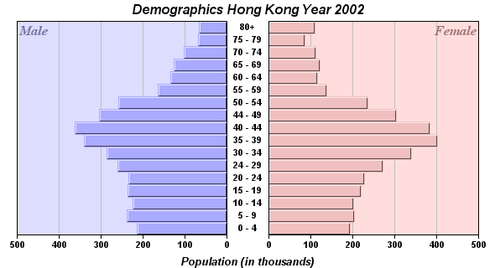
This is actually two bar charts, combined with the SimplexNumerica Multi-Chart object. SimplexNumerica allows arbitrary charts to be combined together.
Note the x-axis directions of the two charts are opposite to each others. In SimplexNumerica , axis direction is configurable.

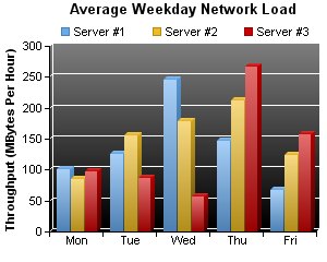
A multi-color bar chart with a gradient background color and soft lighting effects.
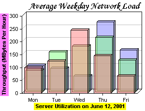
A multi-color bar chart with a gradient background color and glass lighting effects.
All axes are hidden and only the axis labels are shown.
Note this chart is configured to be symmetrical. There are axis labels on both the left and right sides.
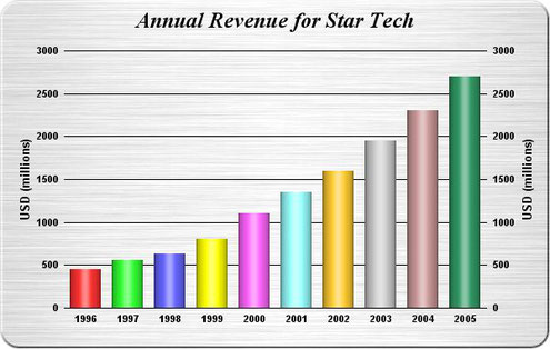
A multi-color bar chart with a brushed silver background and cylindrical bars.
Note this chart is configured to be symmetrical. There are axis labels on both the left and right sides.
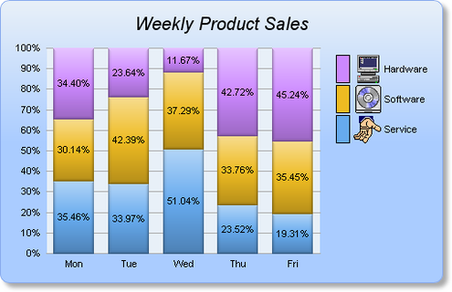
A percentage bar chart in which the bars are automatically scaled to stacked up to 100%.
Note the legend keys contain icons. They are created using ChartDirector Mark Up Language (CDML).

A percentage bar chart taken from a real life application.
Note that x-axis labels. They are rotated by 45 degrees to avoid overlapping.
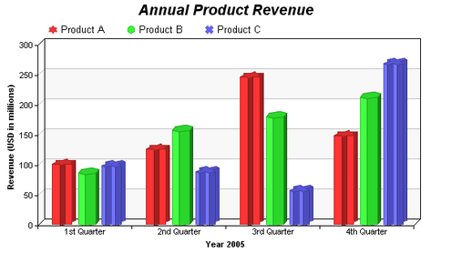
A multi-bar chart configured to use different bar shapes for data series.
Note the legend keys. They reflect both the shapes and the colors.
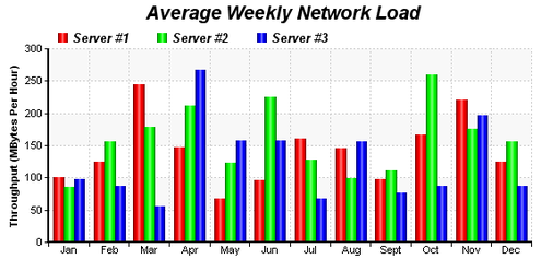
A multi-bar chart configured to use cylindrical bars.
A multi-bar chart configured with overlapping bars.

The bar chart is colored using "zone colors". Zone colors are colors that changes abruptly at user-defined threshold positions.
The background, bar and label colors of this chart uses three zone colors with thresholds at y = 0.

A horizontal bar chart with axes and grid lines hidden. Data values are shown using text labels instead.
Note the bars are gradient colored. The color changes smoothly from dark green on the left to white on the right.
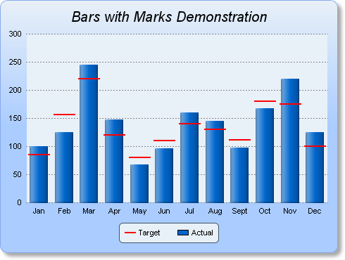
This chart is created using a bar layer and a box-whisker layer. The box-whisker layer is configured to show the whisker only, and this creates the marks.
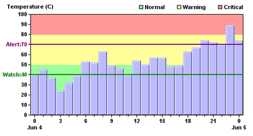
This chart demonstrates the mark and zone features of SimplexNumerica.
The red, yellow and green background regions are user-defined zones. The "Alert" and "Watch" lines are user defined marks.
The bars are configured with rasied borders and touch each others, so there are no gaps between bars.